Matthew Chappell1
Brad Davis2
Bodie Pennisi1
Merritt Sullivan3
There are many things to consider when designing an exceptional landscape. Plants play an important role in making landscapes function well for both human and natural systems. Besides function, plants make landscapes attractive. A landscape full of colorful and interesting plant combinations generates attention and can direct people toward a focal point. As a major design principle, plants can express each of the elements of art that are defined as form, line, shape, color, texture, space and value. When combined, these artistic elements begin to express the principles of design, including emphasis, balance, harmony, variety, movement, rhythm, proportion and unity. Color is a strong design element and can be used to attract attention and guide the human eye. Because of its strength, color can also become a problem when used incorrectly.
This publication explores color relationships in the landscape, ways of seeing plants in terms of color, and various ways to use color successfully in plant selection and landscape design and composition. However, one must remember to consider all elements of art before completing a landscape design.
Primary and Secondary Colors
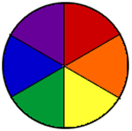 Figure 1.
 Color wheel.
There are three primary colors -- blue, red and yellow -- that can be mixed in different ways to make all other colors. Secondary colors -- green, orange and violet (purple) -- are made by mixing two primary colors. For example, when blue and yellow are mixed, they make green. When yellow and red are mixed, they make orange. When red and blue are mixed, they make purple. An easy way to visualize this is with a color wheel (Figure 1). Color is also referred to as hue, or pure color.
Perception of Color
Colors can be described as cool or warm. Green and blue are cool colors. They are usually associated with water, sky and forest and they evoke relaxed and calm feelings. Red, orange and yellow are warm colors often associated with heat, fire and the sun. Because of this, they demand attention and evoke excitement. Purple is often confusing because it can be either a cool or warm color depending on other colors that appear adjacent to it in a landscape. When purple appears near blue, it is perceived as a cool color. When near red, purple is seen as a warm color. It may seem odd that colors can have such an effect on people, but this has long been studied by psychologists and is used in the design of many products and places. For example, fast food restaurants typically use warm colors to excite customers and get them in and out the door faster whereas hospitals typically use cool colors in rooms to create a calm and relaxing atmosphere.
Color Value
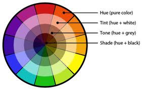 Figure 2.
 Color value.
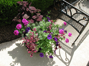 Figure 3.
 A container planting with various shades and tints of purple.
Value is the lightness or darkness of each color. Adding white, black or white and black (which combine to make grey) to each color changes its value (Figure 2).
When white is added to a color it becomes lighter and is called a tint. When black is added, it makes a color darker and it is called a shade. When grey is added it is called a tone. Let's take red, for example. When white is added to red, it turns pink, a tint of red. When black or grey is added to red, it turns maroon, a shade of red. Value is important in the landscape because the human eye is drawn to tints and shades, especially when tints, shades and tones are used close together. This creates a rich visual combination that is more complex and interesting than simply one color used repeatedly without any variation (Figure 3).
Color Intensity
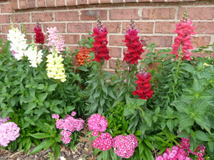 Figure 4.
 Pink, orange, red, yellow and white flowers against a brick building background.
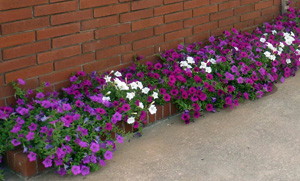 Figure 5.
 Pink, purple and white petunias against a darker brick building background.
Intensity refers to a color's brightness. This is important to consider in the landscape because other surroundings (or context) affect a person's perception of color. When several bright or intense colors are used together, they increase the intensity of one another (Figure 4).
In contrast, when shades or tints are used together, the overall effect is softened and less intense. Colors used with white appear brighter than the same colors used with black or very dark greens. In the case where a planting is located next to a white or dark-colored building, the background will affect the perception of plant colors (Figures 4 and 5).
Color Schemes
Natural landscapes can provide inspiration for good color combinations. Most people describe colors using landscape terms, such as sky blue, grass or sage green, or fire red. Looking at natural landscapes and all of the subtle color combinations that nature produces can be great inspiration for designing gardens. A sunset might inspire a warm color scheme, or a walk through a forest might inspire a cool scheme using different shades of green, from grey-green to blue-green to yellow-green.
By planning what colors to plant, the landscape architect or landscaper creates a theme for the design, or a color scheme. There are at least six different color schemes to choose from and they mostly refer to positions on the color wheel. Each evokes a different psychological response.
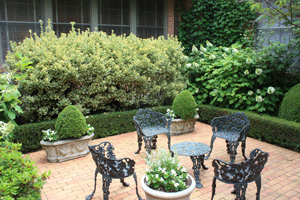 Figure 6.
 A monochromatic color scheme using green as a base color. Whites and various shades of green create a subtle and soothing garden space.
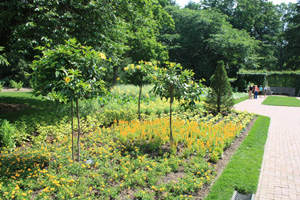 Figure 7.
 Analogous green and yellow colors are visually pleasing and create a warm impression.
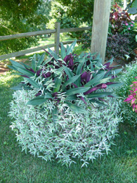 Figure 8.
 Analogous white, light green and purple colors create a cool impression.
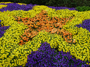 Figure 9.
 A planting of pansies using a complementary color scheme.
Monochromatic
Monochromatic color schemes use one color and its various values (tints and shades). Such schemes have harmonious visual effect (Figure 6).
Analogous
Analogous color schemes use colors that are next to each other on the color wheel. For example, orange and red are analogous; from a distance, a planting of orange and red may appear as a planting of the same color. This is because of the closeness of the colors on the wheel. However, up close analogous colors create a rich mix of colors that blend well and are visually harmonious. Depending on the color, a warm or cool effect can be achieved (Figures 7 and 8).
Complementary
Complementary color schemes use colors that are opposite each other on the color wheel. Each complementary color adds to the intensity of its opposite. For example, on the color wheel purple and yellow are opposite each other. Both colors complement each other and make the brightness of the other increase. Purple and yellow is a popular combination because the colors accent one another and make each other stand out (Figure 9). In a landscape, complementary colors are often most successful when one color is more dominant than the other, rather than in equal proportions (in Figure 9, the yellow pansies dominate).
Primary
Primary color schemes use the three primary colors, red, yellow and blue. They are bright and energetic, especially when used together. Children's playgrounds and toys are often designed using the three primary colors in order to attract attention and stimulate the developing mind. In other settings, primary colors may be too visually jarring. This is easily corrected by using shades or tints of the primary colors together (Figures 10 and 11). For example, in sixteenth and seventeenth century French culture, royal interiors were often designed using a very dark shade of red, a dark shade of blue and a shade of yellow we call gold.
 Figure 10.
 Using many colors together can create a lot of energy.
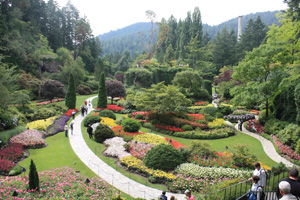 Figure 11.
 In Buchardt Gardens the emphasis on primary colors draws attention and invites the garden visitor to enter and explore.
Riotous
 Figure 12.
 All of the colors of the color wheel have been used here; however, the pinks dominate and tie the overall composition together.
Riotous color schemes are best defined as the use of multiple colors in a vibrant and bold combination. This is the most difficult scheme to achieve successfully. With the use of so many colors, some may clash, and the human eye may have nowhere to focus. This scheme can be too energetic and visually stimulating; therefore, repeating colors is important to ensure unity (Figure 12).
Pastel
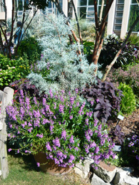 Figure 13.
 The silvery grey foliage of Juniper and grasses combine well with the purple foliage of Coleus and mauve flowers of Angelonia.
Pastel color schemes use color tones to create soft and subtle effects in the landscape. Pastel colors combine best with other pastel colors and work well with plants with silver or gray tinted foliage (Figure 13).
Using Foliage Color
We use plants not only for their flower color but also for their foliage. Indeed, many plants have more attractive leaves (or foliage) than flowers. Most people think "green" when they think of foliage, but there are many other colors and many plants with leaves that have multiple colors on just one leaf. These are called variegated leaves (Figure 8 shows variegated Zebrina). Some variegated leaves have stripes of different colors (usually white cream or yellow and green); others have patches or blotches of color, including white, cream or yellow and green, pink, purple and green, or yellow, orange, red, copper and green (Figures 14a-f). When using variegated or foliage-colored plants it is important to apply the same color scheme rules described above (Figure 15).
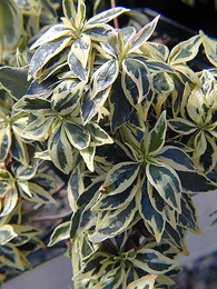 Figure 14a.
 Variegated foliage of Abelia.
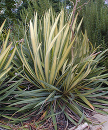 Figure 14b.
 Variegated foliage of Yucca.
 Figure 14c.
 Variegated foliage of Eleagnus.
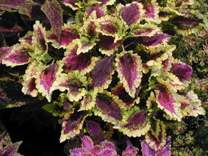 Figure 14d.
 Variegated foliage of Coleus.